
For more than two decades, the Windows Mouse Indicator has been a quiet accessibility staple. When you lost your cursor on a large screen, you pressed Ctrl and watched a circle pulse where the pointer was hiding. The feature arrived in the early 2000s and became a lifeline during the Windows XP era, and it has barely changed since. Now Microsoft is finally giving the Windows 11 Mouse Indicator a modern rewrite.
According to reporting from Windows Latest, a user known as PhantomOfEarth spotted a new, code-behind-modern implementation of the indicator in an Insider preview. It replaces the legacy version, looks noticeably sharper, and adds a small but genuinely useful new option. Here is everything that changed, plus a look at the other legacy Windows 11 pieces getting the same treatment.
#1 The Windows 11 Mouse Indicator is getting a modern rewrite
If you have never used the feature, here is how it works. Open Windows Settings, navigate to Accessibility, and open the Mouse pointer and touch page. Toggle on the Mouse Indicator, then press Ctrl. A circle animation expands around your pointer to show exactly where it is.
The basic behavior is unchanged, but the underlying implementation is new. In practice, that means the animation runs more smoothly than the older version, which some users found a bit janky. Microsoft has not released an official changelog entry for this tweak, so the details below come from the Insider build and the reporting by Windows Latest — expect refinements as the feature approaches a production release.
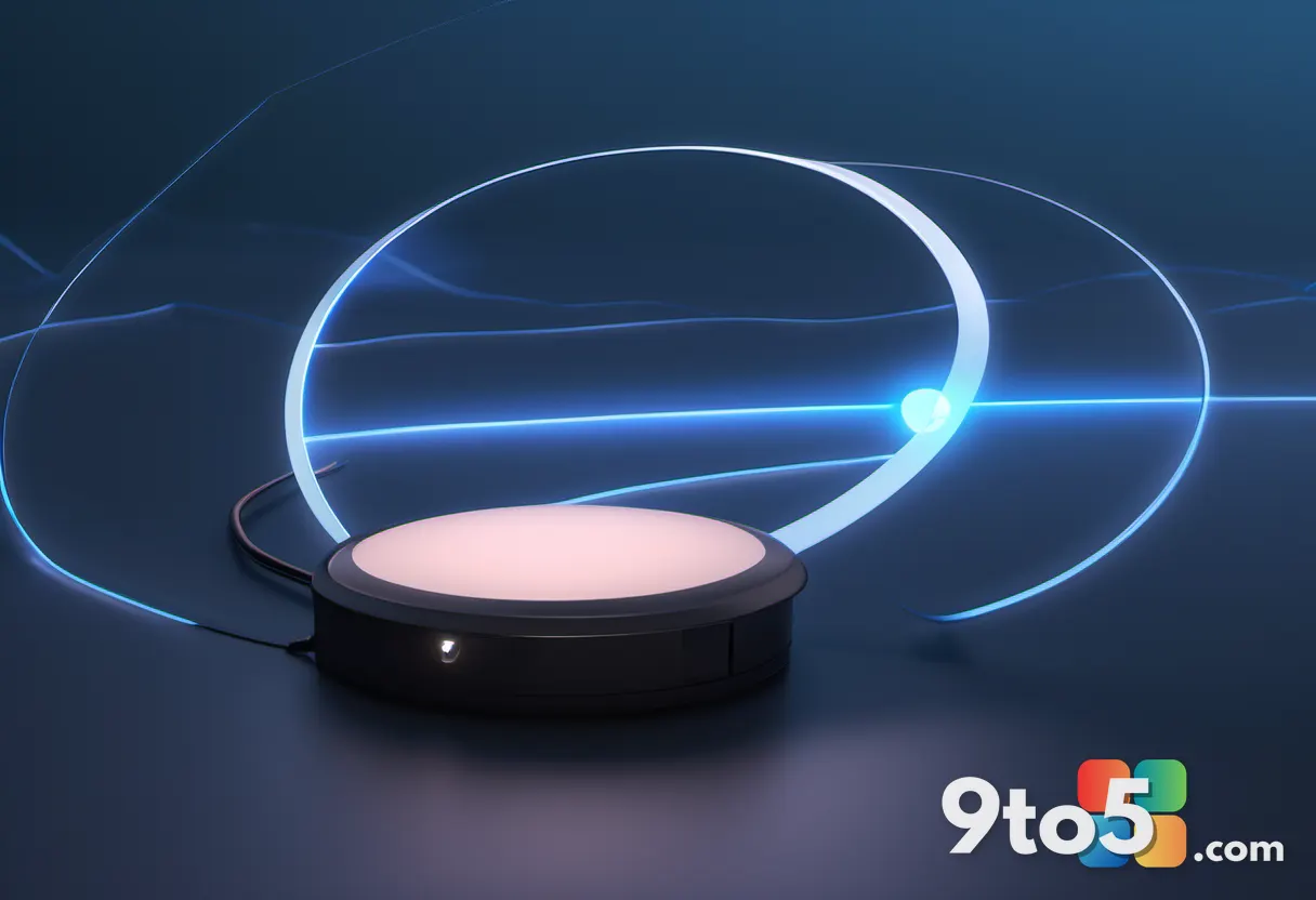
The headline addition is an option called “Keep indicator visible until dismissed.” With the old setup, the circle vanished the moment you released Ctrl. Now, if you press Win+Ctrl+Shift+M instead, the highlight stays on screen until you dismiss it. You can hide it by pressing the shortcut again, pressing Esc, or simply clicking.
That sounds minor, but it matters for anyone hunting for a tiny pointer on a big or multi-monitor setup. Instead of holding a key the entire time, you trigger the indicator once and it lingers while you track down the cursor. It also brings the built-in feature closer to the experience offered by Microsoft PowerToys, which dims the rest of the screen to spotlight the pointer and can be closed with Esc.
#2 A fresh AutoPlay dialog replaces the Windows 8-era popup
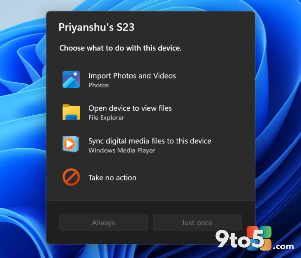
The modernization is not limited to the cursor. Microsoft is also overhauling AutoPlay, the prompt that appears when you plug in a phone, drive, or other device and ask what you want to do with it.
AutoPlay last saw a redesign in Windows 8, and that change is widely remembered as a step backward. Microsoft dropped the ability to remember your preference, so every time you reconnect a device you are asked again whether to open File Explorer or do something else. The new WinUI-based dialog fixes that: it remembers your choice, responds faster, and no longer forces you to unplug and reconnect if you miss the alert.
It also moves the dialog into the Notifications Center, so you can act on a connection without the popup floating in the corner of your screen. The result is a dialog that feels consistent with the rest of Windows 11 rather than a leftover from an earlier decade.
#3 The Properties sheet is getting WinUI, dark mode, and scaling support
One of the most frequently opened legacy dialogs in Windows is the Properties sheet — the one you reach by right-clicking almost anything and choosing Properties. It has kept a nearly identical look for years, and it is now being rebuilt with modern WinUI.
The redesign brings support for display scaling, dark mode, and a layout that better matches the surrounding interface. For users who work with high-DPI monitors or prefer dark themes, that is a real quality-of-life improvement, since older dialogs can look blurry or out of place on sharp displays.
#4 Print Management gets a modern rewrite
Last but not least, Microsoft is rolling out a modern, WinUI-based Print Management app. The tool, which lets you manage printers, servers, and print servers in one place, is being rebuilt from the ground up rather than patched.
According to Windows Latest, the new app is expected to reach production builds in the coming weeks, making it one of the modernization efforts most likely to reach everyday users first.
What this means for you
The common thread across all of these changes is consistency. Microsoft has been promising to modernize more corners of Windows 11, and these small, unglamorous pieces — a cursor helper, a right-click menu, a printer tool — are exactly the kind of thing that makes an operating system feel polished over time.
There is also a broader signal here. After the departure of key executives such as Panos Panay, Windows was widely assumed to be on the back burner. Instead, the OS appears to be getting a steady rebuild focused on a unified design language. Whether that reflects a genuine strategic shift or simply a more patient development pace is open to interpretation, but the direction is clear.
One caveat: most of these improvements are currently available only through the Windows Insider Program. That means the average user may not see them for some time, which is why many people feel like nothing is changing. In reality, more and more parts of Windows 11 are quietly getting the modern treatment.
How to try the modernized Mouse Indicator
To test the new indicator yourself, you need to be running a recent Windows Insider preview build. Once installed, head to Settings > Accessibility > Mouse pointer and touch and turn on the Mouse Indicator. If your build includes the new option, you will find the “Keep indicator visible until dismissed” toggle there, and you can use Win+Ctrl+Shift+M to keep the highlight on screen.
For users who cannot or do not want to join the Insider channel, PowerToys still offers a capable alternative in the meantime — the screen-dimming “Where is my Mouse” utility that many find even more useful than the built-in feature.
Are you hoping Microsoft keeps modernizing these small legacy pieces, or do you think the focus should be on bigger features? Let us know in the comments.
Source: Windows Latest
Over to you: Will you switch to the new Win+Ctrl+Shift+M shortcut, or keep holding Ctrl to find your cursor?
You may also like
 Windows 11 Will Let You Force Apps to Open Maximized by Default
 Windows 11 Experimental build adds automatic PDF previews in File Explorer
 Windows 11 Insider Preview builds bring a modernized Autoplay and a new ‘Open apps maximized’ setting
 Windows 11 Could Let You Decide How Much RAM Goes to Graphics and AI