
When Microsoft recently unveiled a new Windows Search experience as part of its Windows 11 design overhaul, one user took to social media with a blunt opinion — and it prompted a candid reply from the company’s design leadership.
The comment that started it all
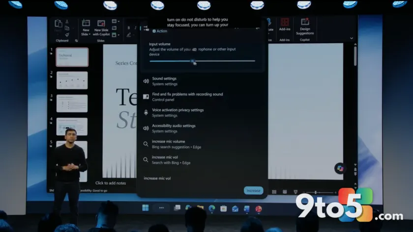
As part of Windows 11’s coming “UI rejuvenation,” Microsoft showed off a redesigned Windows Search that runs actions directly in the results. Search for “dark mode” and you’ll get a toggle to switch it on or off immediately, rather than being bounced over to Windows Settings. In a demo, microphone volume controls appeared right in the search pane.
That’s a genuinely useful direction, but a user replied with something along the lines of: “I honestly hope this kills the Start Menu. That s****’s dated and I do everything I can to avoid it when I’m forced.” The comment drew the attention of Diego Baca, Vice President of Design at Windows.
The Windows 11 design boss weighs in
Baca didn’t argue with the user. Instead, he framed the tension as a fundamental design challenge.
“That’s one of the biggest challenges of designing an OS for over 1 billion people. Everyone has different preferences and workflows,” Baca wrote on X. “Our goal is to improve performance and quality while offering more customization, so people can use Windows in ways that work best for them.”
The point is worth sitting with. Windows 11 ships on everything from budget Chromebook-style laptops to workstation-grade PCs, used by everyone from teenagers to enterprise IT departments. A design choice that speeds up power users can feel like clutter to someone who just wants their files. That’s why Baca’s answer wasn’t “we’re killing the Start menu” or “we’re keeping it exactly as is” — it was “we’re giving you more ways to shape it yourself.”
It’s a stance the 9to5Windows writer can partly relate to, having cut down on Start menu clicks by using PowerToys’ Command Palette Dock as a second taskbar. But even a heavy search-driven workflow doesn’t justify demanding Microsoft rip out a feature millions of people still rely on.
Why the Start menu has become a lightning rod
The Start menu debate isn’t new, and the recommendations piece is where it got loudest. The “Recommended” or “Recent” section at the bottom of the Start menu has long been one of the most criticized features in the Windows Feedback Hub. Yet Microsoft’s own researchers liked the idea, referring to it as a “dynamic” feed.
In 2025, Microsoft expressed enthusiasm for the recommended feed, describing its purpose as a way to “accelerate the day.” In a design post on microsoft.design, the company laid out the intended use cases:
- Surfacing “yesterday’s missed meeting recording at 9 am”
- Bringing back “snap groups to get you back in the flow throughout the day”
- Highlighting “that app you always open around 2 pm”
- Presenting “the app you didn’t know you needed just when you need it”
Microsoft says all of this is driven by “user feedback” — though it hasn’t disclosed how much of that feedback was positive. Historically, the majority of Feedback Hub votes on this feature have run the opposite way, which leaves some users wondering whether the company acted on a vocal minority and then retroactively justified it.
A broader promise to revive Windows
This design conversation lands against a larger backdrop. In March 2026, Microsoft publicly acknowledged that it had neglected Windows and promised to bring the operating system back to life. The reaction was skeptical at best — this isn’t the first time the company has promised a Windows revival.
At one point, CEO Satya Nadella talked about wanting people to move from merely needing Windows to actually loving it. Little changed, and Windows slipped into a period with fewer improvements and more preinstalled bloatware. By 2026, that damaged reputation is now seen as hurting Microsoft’s broader AI ambitions.
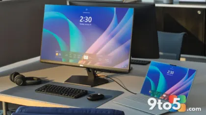
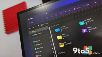
The 2026 roadmap is where Baca’s “customization” promise gets concrete. Microsoft has pointed to a Windows 11 “design rejuvenation” — modernizing legacy interfaces and leaning more heavily on WinUI-based features. It has also committed to shipping 100% native apps on Windows 11, aiming to fix what it sees as a web-app-driven experience that degrades the OS. And in a nod to the Start menu debate, Microsoft already added toggles that let you hide the Pinned, Recent, and All sections individually.
What this means for you
The bottom line is that Microsoft is signaling it will keep the Start menu — but make it more yours. If you’ve been annoyed by the Recommended section, you can already start hiding it. If you prefer a search-first workflow, the new action-driven Search is heading your way. And Baca’s framing suggests future updates will lean toward giving you more switches to flip rather than forcing a one-size-fits-one-billion layout.
Practically, keep an eye on the Windows 11 update channel for the design-rejuvenation changes. If you want control today, open the Start menu settings to toggle Pinned, Recent, and All, and consider PowerToys for a command-palette alternative to the Start menu. The direction seems right, but as Baca himself admitted, no design can make everyone happy — so the goal is to make it easier for you to make it your own.
Source: Windows Latest
Over to you: Do you think giving users more Start menu toggles is enough, or should Microsoft remove the Recommended section entirely?
You may also like
 New Windows Search Experience Heads to the Taskbar for Insiders
 Windows 11 26H2 reportedly runs on shockingly low RAM thanks to a Rufus trick
 Intel Ships First Driver Quality Initiative Fixes as Microsoft Admits One Bad Driver Crashes Windows
 Microsoft Quietly Blocks a New Windows 11 Requirements Bypass Trick