
Microsoft Office files have a habit of looking different when you open them in another suite. And a LibreOffice developer is now putting a name to one of the most persistent complaints: LibreOffice charts that simply won’t display.
The chart rendering problem
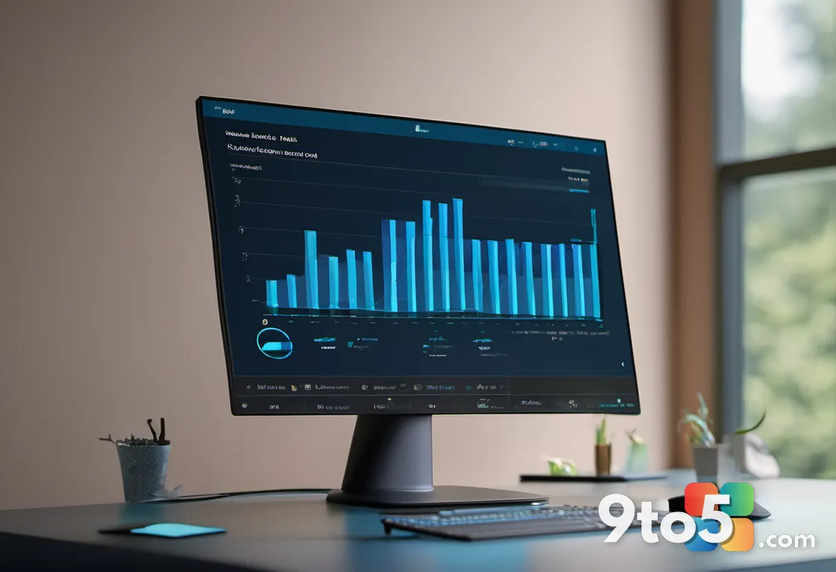
When you open a Word or PowerPoint file that contains a chart, most of the time it looks fine. But occasionally, a chart opens as a blank space, a garbled mess, or a rough approximation of what was originally created in Microsoft Office. This has been a recurring complaint in the LibreOffice community, and it’s the kind of interoperability gap that tends to favor Microsoft’s own ecosystem.
The developer stepped in to explain exactly what’s going on under the hood, rather than leaving users to assume the open suite was just cutting corners on rendering.
What the developer found about LibreOffice charts
The core issue is about how charts are stored. In Microsoft’s OOXML format, a chart lives as a block of XML in the chart namespace — essentially a set of numbers, labels, and styling rules that a rendering engine reads back into a picture. LibreOffice has its own charting engine, and when it opens an Office file it has to translate that XML into its own internal representation before it can draw anything.
According to the developer, as reported by Neowin, some charts use chart types or styling features that LibreOffice’s translator doesn’t fully understand. When the source file relies on a Microsoft-specific rendering path, LibreOffice either can’t map it correctly or produces a version that’s visibly off. In other words, the chart data is there — it’s the conversion that breaks down.
That distinction matters, because it means the underlying numbers and labels usually survive the open. What you’re seeing is a rendering gap, not a total loss of the chart itself.

A familiar interoperability fight
This isn’t the first time LibreOffice and Microsoft Office have clashed over chart compatibility. The two suites have used different chart formats for well over a decade, and the gap has narrowed over time but never fully closed. Microsoft’s Office files can look perfect in Word or PowerPoint, but the moment they cross into a cross-platform open suite, you can hit exactly this kind of rendering discrepancy.
What makes this story notable is that the developer chose to explain it publicly rather than treat it as an embarrassment. It’s a reminder that open formats aren’t always fully open in practice, and that the “it should just work” assumption doesn’t always hold when files move between suites.
What this means for you
If you’re the one sending files, the risk is real but limited. A chart you create in Microsoft Office might open as a blank or awkward placeholder in LibreOffice, which can look sloppy in a presentation or a report to a colleague. The reverse is also true: a chart you edit in LibreOffice might not render perfectly when reopened in Microsoft Office.
For most everyday users, the safest path is to keep the file inside the suite it was created in until it’s final. If you need to share a chart that must look exactly as designed, exporting it as a PDF or an image is the most reliable way to lock in the appearance before it gets converted again.
How to handle the mismatch
There are a few practical steps you can take. First, if you’re opening an Office file in LibreOffice and a chart looks wrong, don’t assume the data is lost — it usually is, and the fix is to edit the chart back in Microsoft Office where it was made.
Second, for anything that needs to look pristine, export to PDF before sending. Third, if you rely on cross-suite editing, consider keeping charts as images rather than live objects so there’s no conversion step at all.
Source: Neowin
Over to you: When a chart won’t render, do you edit it back in Microsoft Office or just export it to PDF? Which route do you take?
You may also like
 Microsoft Finally Adds Microphone and Camera Streaming to Mixed Reality Link
 Windows Admin Center 2610 Enters Public Preview With Unified Installer and Upgrades
 Tarae: The Unbound Preview — An Eastern Diablo With a Story of Its Own
 Windows Weekly 1001: A Buggy Patch Tuesday, New Insider Builds, and More