
Microsoft is preparing to introduce a significant shift in how users interact with Teams meetings, signaling a major evolution in the platform’s user experience. According to recent reports, the company is rolling out a new meeting interface that relocates several familiar controls, aiming to streamline the layout and prioritize content visibility during calls.
For long-time users, this change represents more than a cosmetic tweak; it alters the muscle memory built over years of daily video conferencing. The update is part of Microsoft’s ongoing effort to modernize the Teams client, which has undergone numerous iterations since its initial launch. As the digital workplace continues to evolve, these interface adjustments reflect a broader strategy to reduce clutter and enhance focus during collaborative sessions.
What is changing in the Teams meeting interface?
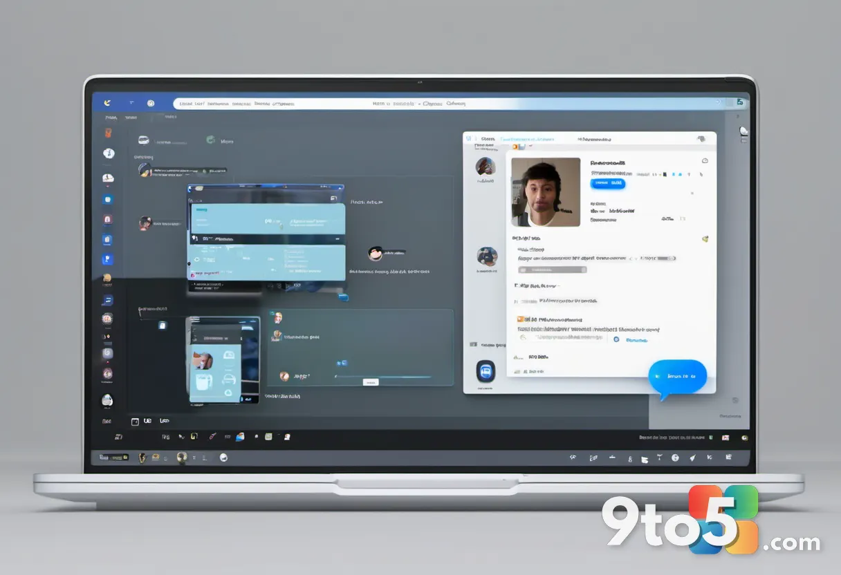
The core of this update involves the relocation of meeting controls that users currently access via a floating toolbar or a dedicated bottom bar. In the new design, these interactive elements are being moved to a more integrated position within the meeting window, likely to maximize the available screen real estate for video feeds and shared content.
While specific details on the exact placement have been kept under wraps until the full rollout, the general direction points toward a more minimalist approach. This shift aligns with current design trends in productivity software, where the goal is to make tools less intrusive while remaining easily accessible. Users can expect a cleaner visual field, which may help reduce distractions during important presentations or large group discussions.
Why Microsoft is reshuffling the layout
The decision to redesign the meeting interface likely stems from user feedback and internal data regarding how people actually use the platform. Over time, the accumulation of features in Teams has led to a increasingly complex interface, which can sometimes overwhelm users, particularly those who join meetings frequently rather than host them.
By consolidating and moving controls, Microsoft aims to create a more intuitive workflow. This redesign also addresses the challenge of adapting to various screen sizes and device types, ensuring that the interface remains functional and uncluttered whether you are on a large desktop monitor or a smaller laptop screen. The move is indicative of Microsoft’s commitment to refining the Teams experience to compete effectively in the crowded collaboration market.
How the update will roll out
Microsoft typically deploys interface updates to Teams through its standard update channels. This means the new meeting interface will likely be pushed automatically to users as part of the regular client updates. There is usually no manual action required to receive these changes, as the platform is designed to keep all users on the latest version for security and feature consistency.
However, the rollout is often phased. This approach allows Microsoft to monitor performance and gather initial feedback before the changes reach the entire user base globally. If you do not see the new interface immediately, it is likely that your account is still in a previous wave of the deployment. Patience is key, as the update should appear within a reasonable timeframe for most organizations.
What this means for you
For the average user, the primary impact will be a slight adjustment period as you relearn where to find the mute, camera, and screen sharing buttons. While the new layout aims to be more efficient, the initial transition might feel unfamiliar. It is advisable to take a moment to explore the new control locations during a low-stakes meeting to get comfortable with the changes.
For power users and IT administrators, this update may require a review of any custom scripts or macros that relied on specific interface elements. While Microsoft strives to maintain backward compatibility, significant UI overhauls can occasionally disrupt automated workflows. Staying informed about the rollout timeline will help you prepare for any necessary adjustments to your daily routines.
How to get the update
To ensure you receive the new meeting interface as soon as it becomes available to your organization, make sure your Teams client is set to update automatically. You can check for updates manually by clicking on your profile picture in the top right corner of the Teams app and selecting ‘Check for updates’. This ensures you are running the latest build and ready to experience the redesigned interface the moment it rolls out to your tenant.
Source: Neowin
Over to you: Are you ready for the new Teams layout, or do you prefer the current control placement?