
Microsoft Teams is getting a long-overdue interface overhaul focused on one specific pain point: accidental clicks. The company confirmed via Windows Latest that a redesigned meeting UI is rolling out now, with the goal of eliminating the embarrassing moments that come from accidentally broadcasting your desktop or prematurely exiting a call. Most users will see the changes by the end of August 2026.
Why the Microsoft Teams redesign was necessary
For years, Teams has evolved from a basic video conferencing tool into a full collaboration hub. Word, PowerPoint, Planner, and Copilot all live inside the app now. That expansion came with a crowded interface, and Microsoft’s internal usability studies showed a clear pattern: users were regularly misclicking high-impact buttons. The two most common culprits? The Share button, which instantly broadcasts your screen, and the Leave button, which drops you from the meeting entirely. Even the Raise Hand button caused minor disruptions, though far less than an unintended screen share.
How the new meeting controls work
The redesigned control bar addresses the layout directly. Core actions like Audio, Video, and Share are now grouped together at the top center of the meeting window. The Leave button has been moved to the far right, creating a clear visual separation between “start a feature” and “end the meeting.” Microsoft says the new layout reduces accidental clicks by giving each action its own dedicated zone. If you prefer the old arrangement, you can pin, unpin, and rearrange the controls to match your workflow. Less frequently used tools—recording, captions, meeting notes, breakout rooms, polls, Whiteboard, YouTube, and Planner—have been consolidated into a new More menu to keep the primary bar clean.
What the new sharing panel actually does
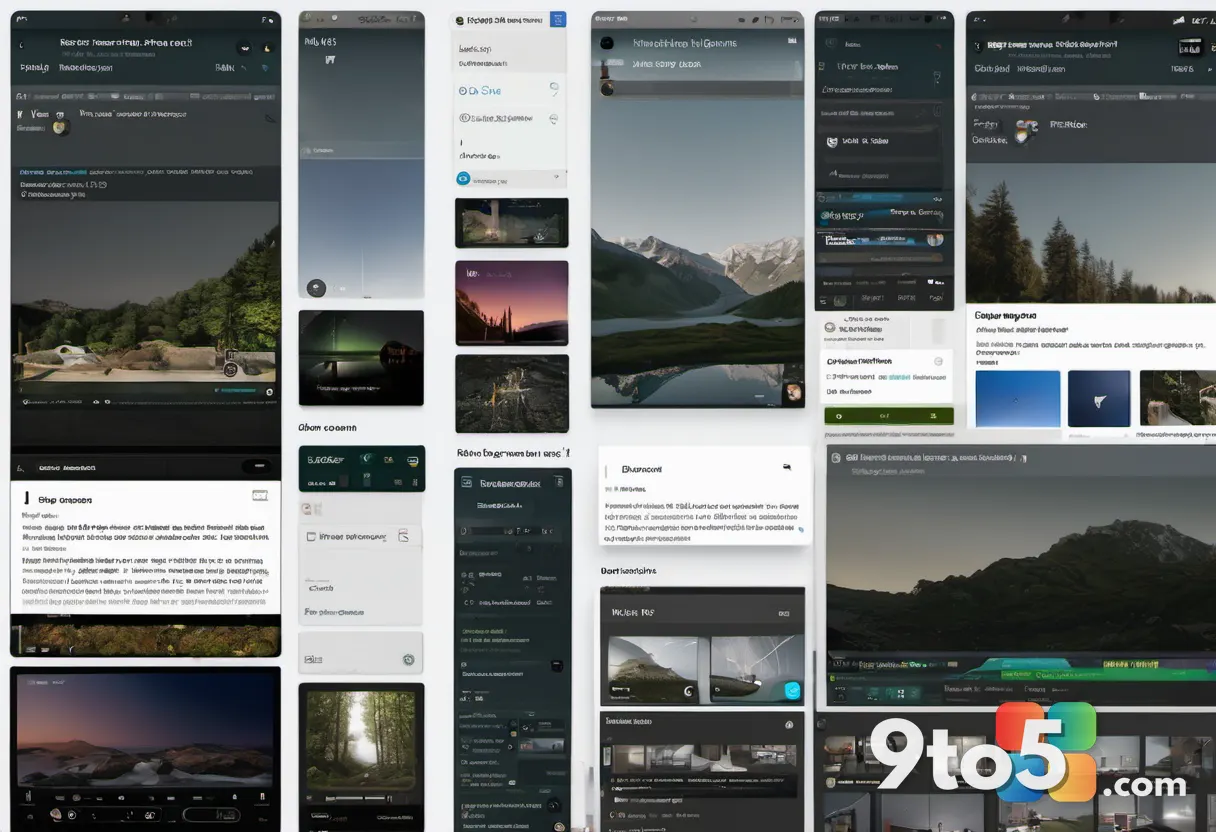
Moving the Share button was only the first step. Microsoft also rebuilt the sharing interface to give you a two-step confirmation flow. When you tap Share, a new panel opens with screens, individual windows, and other sharing options listed on the left. The right side displays a large, live preview of exactly what participants will see. Before you commit, you can choose a presentation mode like Content only, Standout, Reporter, or Side-by-side. You also get a toggle for system audio and an option to apply AI-powered audio optimization. The final Share button sits at the bottom of the panel, forcing a deliberate second click. Microsoft says this two-step process makes accidental screen sharing nearly impossible.
Upcoming features arriving alongside the update
The meeting UI refresh is arriving alongside several other changes Microsoft has been testing. In the coming weeks, you will get a pre-meeting audio test that lets you check your microphone and speakers before joining, similar to Google Meet’s preview screen. Teams is also rolling out a location detection feature for users connected to their organization’s network, alongside AI-powered meeting archives that Copilot can analyze by default. On the privacy side, Microsoft confirmed you can now disable all in-meeting AI features with a single tap, without needing IT admin approval.
What This Means for You
If you have ever accidentally shared a private notification, a sensitive document, or left a meeting while trying to toggle your camera, this update is built for you. The visual separation between sharing and leaving reduces cognitive load during calls, and the preview panel stops you from broadcasting the wrong window. For hybrid teams, the cleaner control bar means less time fumbling with menus and more time focused on the conversation. The pre-meeting audio test will also cut down on the classic “can you hear me?” delays that slow down meetings.
How to Get It
Microsoft is rolling out the redesigned Teams meeting UI to most users now. If you do not see the new layout immediately, it will reach your client by the end of August 2026. To ensure you are on the latest build, open Teams, click your profile picture, and select Check for updates. The new sharing panel and control bar will automatically appear the next time you join or start a meeting. If you prefer the legacy layout, you can customize the control bar by pinning or rearranging buttons, though the two-step sharing flow will remain in place.
Source: Windows Latest
Over to you: Are you glad Microsoft finally separated the Share and Leave buttons, or do you prefer the old layout?