
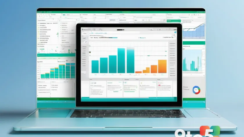
Microsoft is turning your Excel workbooks into something closer to a presentation. Its new Excel Copilot interactive canvas feature lets users generate polished, visual reports straight from the assistant, and the key detail is that these reports stay dynamically linked to the data behind them.
In other words, you no longer have to manually rebuild charts, tables, and layouts every time your numbers change. According to Neowin’s reporting on the feature, the interactive canvas produces customizable visual reports that update as your underlying spreadsheet data shifts — a meaningful departure from the static screenshots and frozen snapshots people often export from Excel today.
What the interactive canvas actually does
Think of the interactive canvas as a separate visual workspace inside Excel, distinct from the traditional grid of cells. Instead of piecing together individual charts and text boxes by hand, you describe what you want in natural language and Copilot assembles a report layout around your data.
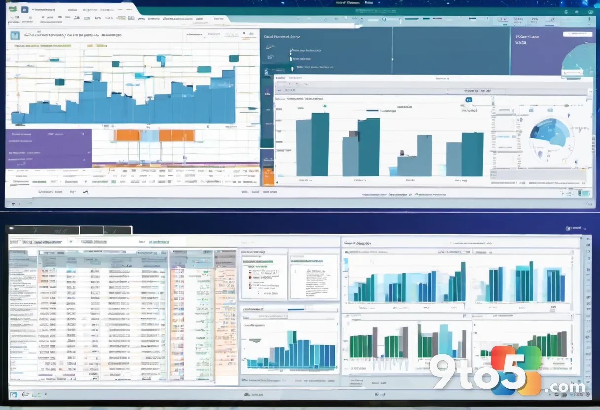
The reports it generates are meant to feel more like a designed dashboard than a spreadsheet tab. That means arranged visuals, labels, and supporting text laid out for readability, rather than a scatter of cells you’d have to format yourself.
The “dynamically linked” part is what makes it useful long-term. When you change a value in your source data, the linked report reflects that change — you aren’t stuck with a one-time snapshot that goes stale the moment its inputs move.
How Copilot drives the process
Copilot is the assistant doing the heavy lifting here. Rather than you dragging and dropping chart types or wrestling with formatting menus, you prompt it with what you’re trying to communicate. It then pulls from your workbook and builds a report accordingly.
The reports are described as customizable, which suggests you can refine the output afterward — tweaking the layout, swapping visuals, or adjusting emphasis — rather than being locked into a single generated result. That blends the speed of automation with the control you’d expect from doing the work by hand.
This fits into Microsoft’s broader push to make Copilot a first-class tool across Office. Excel has already gained Copilot capabilities for writing formulas, summarizing data, and spotting trends; the interactive canvas is the latest step toward turning raw data into shareable, presentation-ready output.
Why this matters for everyday users
For most people, the appeal is time saved on the tedious middle ground of reporting. You can get the raw numbers out of Excel quickly, but turning those numbers into something a colleague or manager can read at a glance has traditionally meant real formatting effort.
Interactive, data-linked reports also reduce the chance of errors. The classic failure mode is exporting a chart, then editing the source data later and forgetting to update the image — leaving everyone looking at outdated figures. A dynamically linked canvas removes that trap, since the visuals track the data automatically.
What this means for you
If you regularly build reports, dashboards, or status updates from Excel data, this could cut down on the repetitive work of rebuilding them. You’d generate a first draft with Copilot, then shape it into something presentable — potentially in a fraction of the time it would take to format everything cell by cell.
It also lowers the barrier for people who aren’t comfortable with Excel’s formatting tools. Describing what you want in plain language and getting a polished layout back is far more approachable than hunting through chart-type menus and manual alignment.

How to get it
The interactive canvas is part of Excel’s Copilot experience, so it’s aimed at users who already have Copilot access within Excel. Availability tends to roll out over time, so if you don’t see it immediately, it may still be reaching your account or region.
To try it, you’d open a workbook with real data behind it, then prompt Copilot for the kind of visual report you want. Because the output stays linked to your data, it’s worth making sure your source cells are clean and well-organized before you generate — Copilot can only work well with what’s actually in the workbook.
As always with Copilot features, exact availability, any licensing requirements, and timing will depend on your Microsoft 365 plan and region, so treat those details as subject to change as Microsoft continues rolling this out.
Source: Neowin
Over to you: Would you trust Copilot-generated reports for client-facing dashboards, or keep formatting everything by hand?