
Several years have passed since Microsoft pulled the plug on its mobile operating system, yet certain qualities of Windows Phone still stand out to anyone who ever used it. The platform never won the smartphone war, but it left a lasting mark on design and interaction that fans still talk about. According to a recent reflection on Neowin, those memorable traits remain a reminder of what made the mobile effort so distinct. Here are the features and ideas that made Windows Phone special — and why they still resonate.
1. Live Tiles
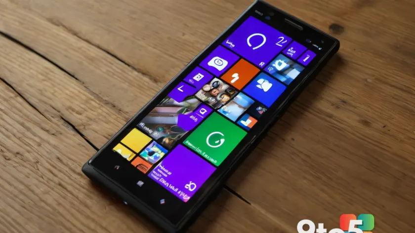
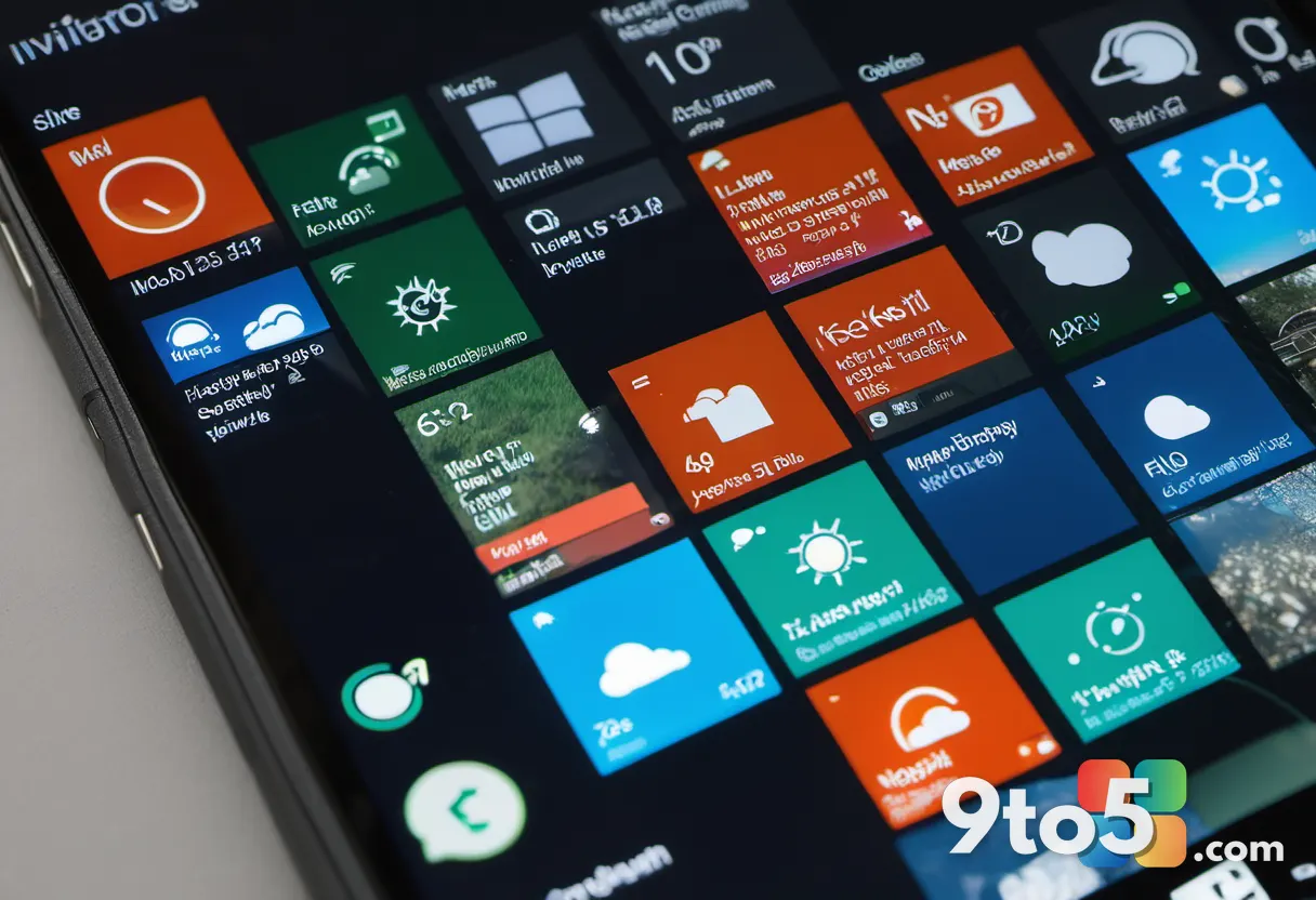
The single most distinctive thing about Windows Phone was its Start screen, built entirely around Live Tiles. Instead of a grid of static app icons, each tile was a dynamic window into the underlying app. Weather changed in real time, new messages appeared at a glance, and a music tile could show playback controls without ever opening the app.
This was a genuine departure from the flat-row-of-logos approach that iOS and Android favored. Tiles came in different sizes — small, medium, and wide — letting users build a Start screen that felt personalized rather than uniform. Tapping a wide tile could reveal a richer snapshot of content before you committed to launching the full application.
For many users, the Live Tiles were the feature that made the phone feel alive. The home screen was not just a launcher; it was a live dashboard of the parts of your digital life you cared about most.
2. The clean design language
Windows Phone arrived with a bold, minimalist design language that Microsoft initially called Metro and later evolved into the Modern Design and Fluent Design systems. The emphasis was on content over decoration: flat colors, crisp typography, and generous whitespace.
That ‘content before chrome’ philosophy felt fresh at a time when many smartphones were layered with gradients, shadows, and faux-3D effects. The type-driven interface, often built around Microsoft’s Segoe font, gave the platform a confident, readable look that was easy on the eyes.
The design was more than aesthetics. It pushed apps to think about how information was presented rather than how much decoration could be piled on top, and it influenced Microsoft’s design thinking across its desktop and web products for years afterward.
3. A consistent experience across apps
Because Microsoft set the design rules, Windows Phone apps shared a recognizable look and feel. Navigation, transitions, and interactions followed a common pattern, which meant learning the phone once paid off across most of what you did.
The system animations — the way screens slid and tiles responded to touch — added to that sense of cohesion. Everything moved with a consistent rhythm, which many users found smoother and more deliberate than the competition.
This uniformity is something fans miss today. In an era of increasingly similar-looking phones, Windows Phone offered a coherent identity that was easy to navigate even if you had never touched the device before.
4. A smarter lock screen
The Windows Phone lock screen pulled notifications and live information into one clean, glanceable view. Rather than a bare clock that you had to swipe past, the lock screen could surface your messages, calls, and even live tiles without unlocking the phone.
Users could set a custom wallpaper, and the system integrated well with the tile-based design so that the look carried through from the lock screen to the Start screen. It was an early example of what many other platforms would later adopt as standard lock-screen notification previews.
For people who valued quick, at-a-glance access to their updates, this felt like a natural and thoughtful way to interact with the phone.
5. A genuinely different identity
Above all, Windows Phone felt different. It was a third option in a duopoly, built on its own assumptions about how a smartphone should look and behave. That distinctiveness is perhaps the quality fans miss most.
The platform never solved its biggest weakness — a smaller app ecosystem than iOS and Android — but it proved that a mobile OS could take a bold creative direction instead of simply mirroring its rivals. The design language it pioneered has since influenced the wider industry.
What this means for Windows fans today
Windows Phone is gone, and its design DNA lives on only in fragments across Microsoft’s current products. For everyday users, the takeaway is less about nostalgia and more about appreciating how platform design evolves. Features that seemed unique back then — live content on the home screen, glanceable notifications, content-first interfaces — are now table stakes across virtually every smartphone.
If you are curious to revisit the look, some third-party launchers and themes still echo the aesthetic on Android, though nothing replicates the full experience. The platform’s real legacy is a reminder that bold design choices can leave an imprint long after the product itself disappears.
Source: Neowin
Over to you: If Windows Phone had survived, which of these five qualities do you think would have defined the next decade of smartphones?