
Windows 11 has undergone a massive visual overhaul since its initial release, bringing a fresh design language to File Explorer, Settings, and the Start menu. Yet, beneath the polished surface, several foundational utilities remain virtually unchanged from the Windows 7 era. These are the tools IT professionals, power users, and even casual troubleshooters rely on daily, and they desperately need a refresh.
Microsoft has acknowledged the challenge of updating deeply embedded components without breaking functionality. The company is actively developing frameworks to streamline these updates, and recent moves like the modernized Print Management app signal a shift in strategy. However, there are three classic utilities that stand out as the most urgent candidates for a redesign: Device Manager, Event Viewer, and the Services console.
The goal isn’t to strip away advanced capabilities but to wrap them in an interface that matches modern usability standards. Here is what a modernization of these tools should look like and why it matters for your workflow.
1. Device Manager Needs a Functional Overhaul
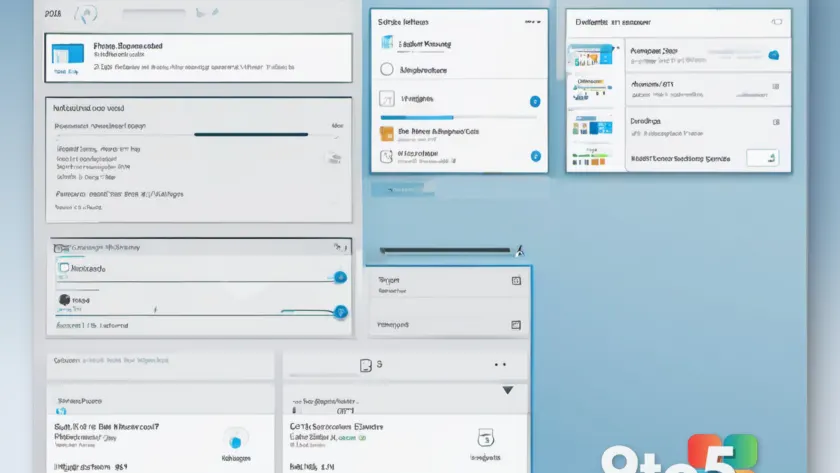
Device Manager is often the first stop when hardware or driver issues arise. Despite its critical role, the interface has seen minimal evolution. The current experience relies on a hierarchical tree view that forces users to expand categories, right-click devices, and navigate through a dense collection of property tabs. While functional, this workflow feels archaic compared to modern management consoles.
A modernized Device Manager should prioritize information density and quick status checks. Instead of a static list, the interface could present a grid or card-based view that immediately displays the device name, manufacturer, current driver version, and installation date. For IT administrators managing fleets, the ability to quickly identify devices with outdated drivers or known issues would save significant time.
Search and filtering capabilities are also essential. Currently, finding a specific device among hundreds of entries can be tedious. A robust search bar that indexes device names, hardware IDs, and driver statuses would streamline troubleshooting. Furthermore, visual status indicators—such as color-coded icons for devices working normally, those with warnings, or those disabled—would provide instant visibility into system health.
Crucially, this redesign must preserve the advanced options that enthusiasts and professionals depend on. The ability to roll back drivers, update hardware, and view detailed properties should remain accessible, perhaps through a collapsible advanced panel or a right-click context menu. The focus should be on presenting the data more effectively, not removing the depth that makes the tool valuable.
2. Event Viewer Should Integrate with Reliability Monitor
Event Viewer is a goldmine of diagnostic data, but extracting actionable insights from it can be frustrating. The tool logs thousands of events across multiple categories, and sifting through them to find the root cause of a crash or error requires significant expertise. Meanwhile, the Reliability Monitor offers a more user-friendly timeline of system stability, yet the two tools operate in isolation.
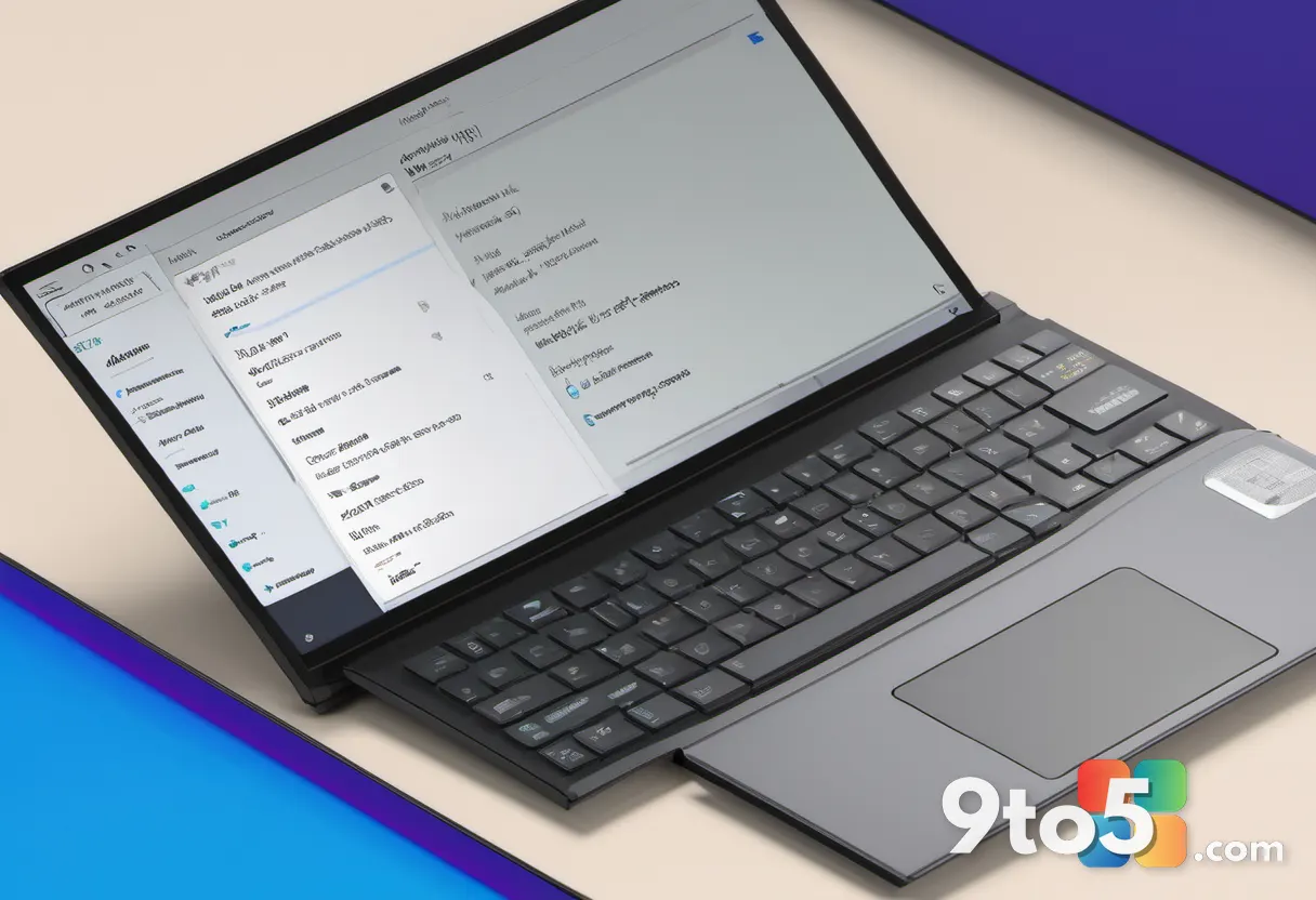
A unified approach would combine the high-level overview of Reliability Monitor with the granular detail of Event Viewer. Imagine an interface that displays a chronological timeline of system events, including crashes, application failures, and driver issues, all in one view. Users could click on a specific event to drill down into the corresponding log entries, bridging the gap between quick diagnostics and deep analysis.
Grouping related events would also enhance usability. Currently, related errors can be scattered across different logs. A modernized Event Viewer could automatically cluster events based on timestamps, error codes, or affected components, making it easier to identify patterns and recurring issues. This is particularly useful for troubleshooting complex problems involving multiple subsystems.
Advanced filtering and export options should remain, but the default experience should cater to users who need quick answers. By integrating these tools, Microsoft can reduce the learning curve for new users while maintaining the power that IT professionals rely on for forensic analysis.
3. The Services Console Requires Better Visualization
The Services console provides a comprehensive list of background processes that manage system functions, from Windows Update to Bluetooth connectivity. While the information available is extensive, the presentation is outdated. The current view lists services with their status and startup type, but understanding the relationships between them requires navigating to the Dependencies tab, which is not immediately obvious.
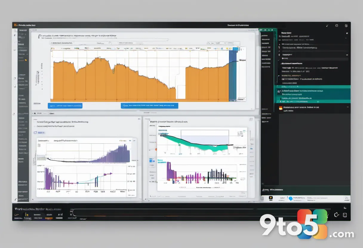
A modernized Services console should visualize these dependencies more clearly. A graph or tree view that shows which services rely on others would help users understand why a particular service might fail. For instance, if a network service isn’t running, the interface could highlight dependent services that are also affected, guiding the user toward the root cause.
Search functionality should be enhanced to support not just service names but also descriptions, executable paths, and even keywords related to functionality. This would allow users to quickly locate services by describing what they do rather than remembering exact names. Additionally, the ability to view service properties in a side panel or modal dialog would keep the main list uncluttered and improve navigation speed.
The “Extended” view, which offers more detailed information, should be integrated more seamlessly into the main interface. Advanced options like recovery settings and logon accounts should be accessible without losing context of the service’s current status. This balance between simplicity and depth is key to making the Services console more approachable.
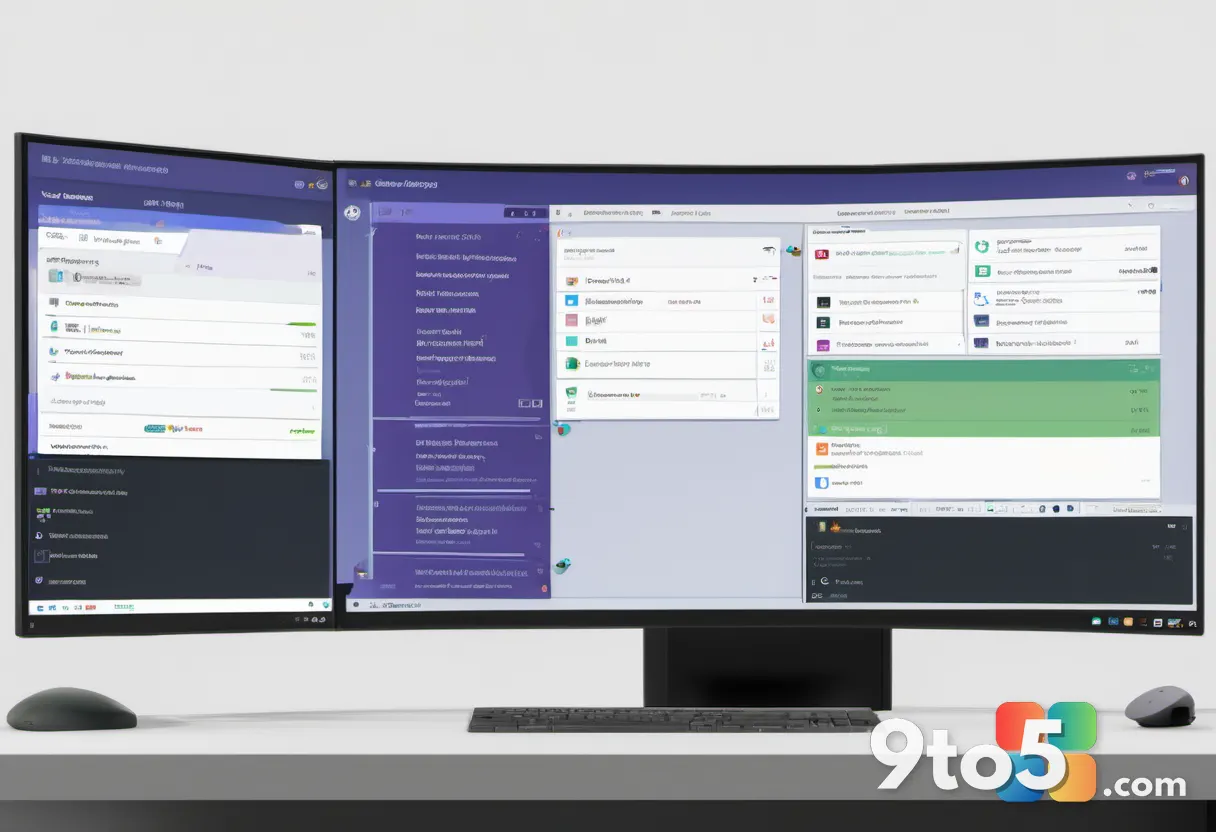
4. Task Scheduler Deserves a Modern Interface
Task Scheduler is a powerful tool for automating system tasks, yet its interface can be intimidating. The “Create Basic Task” wizard simplifies common scenarios, but the full Task Scheduler offers a complex array of triggers, actions, conditions, and settings spread across multiple tabs. This fragmentation makes it difficult for users to grasp the overall configuration at a glance.
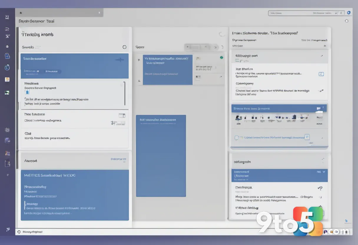
A redesigned Task Scheduler could adopt a card-based layout for tasks, displaying key information such as the trigger time, action, and last run status. This would provide a quick overview of all scheduled tasks without requiring users to open each one individually. Advanced configurations could be revealed through an expandable section or a dedicated properties pane, keeping the main view clean.
Visualizing task dependencies and execution history would also add value. A timeline view showing when tasks ran and their outcomes could help users identify failures or overlaps. Additionally, integrating search and filtering options would allow users to quickly locate tasks by name, status, or trigger type.
For those seeking a modern alternative today, open-source projects like FluentTaskScheduler demonstrate what is possible. These projects offer a refreshed UI that retains all original functionality while improving usability. Microsoft could draw inspiration from such efforts to guide the official redesign, ensuring that the tool remains powerful without being overwhelming.
What This Means for You
The modernization of these tools reflects a broader shift in how Microsoft approaches legacy components. The company is moving away from simply applying a visual skin to deeply embedded utilities and instead focusing on reimagining the user experience while preserving functionality. This approach acknowledges that these tools serve diverse audiences, from casual users troubleshooting a driver issue to IT professionals managing enterprise systems.
For everyday users, the changes would mean faster troubleshooting and a more intuitive way to understand system health. For power users, the retention of advanced options ensures that productivity isn’t compromised. The gradual rollout of these updates, as seen with the Registry Editor and Print Management, suggests that Microsoft is building the necessary frameworks to support these changes without disrupting existing workflows.
As Microsoft continues to refine Windows 11, keeping an eye on these classic tools will be essential. Their evolution will likely set the standard for how legacy utilities are handled in future Windows versions, emphasizing usability without sacrificing depth.
Source: Latest from Windows Central
Over to you: Which of these classic tools do you think needs a redesign the most, and what features would you add?