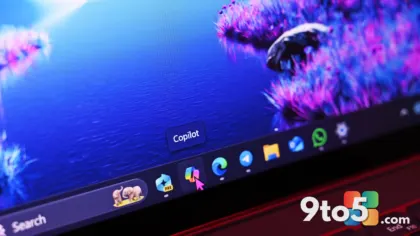

Microsoft’s Copilot has become a central part of the Windows experience, but the visual identity surrounding the AI assistant might be on the verge of a change. According to a recent report from Neowin, Microsoft may have accidentally leaked a new Copilot icon that signals a shift toward a cleaner, more minimalistic design language. While the company has not officially confirmed the update, the appearance of the asset in internal or test environments suggests that a redesign could be in the pipeline.
For users who have grown accustomed to the current Copilot branding, this potential shift raises questions about what the future holds for one of Microsoft’s most visible AI features. The leak comes at a time when Microsoft has been refining its Copilot integration across Windows 11, Edge, and Office, making any visual overhaul a notable development for everyday users and power users alike.
What the Leak Shows
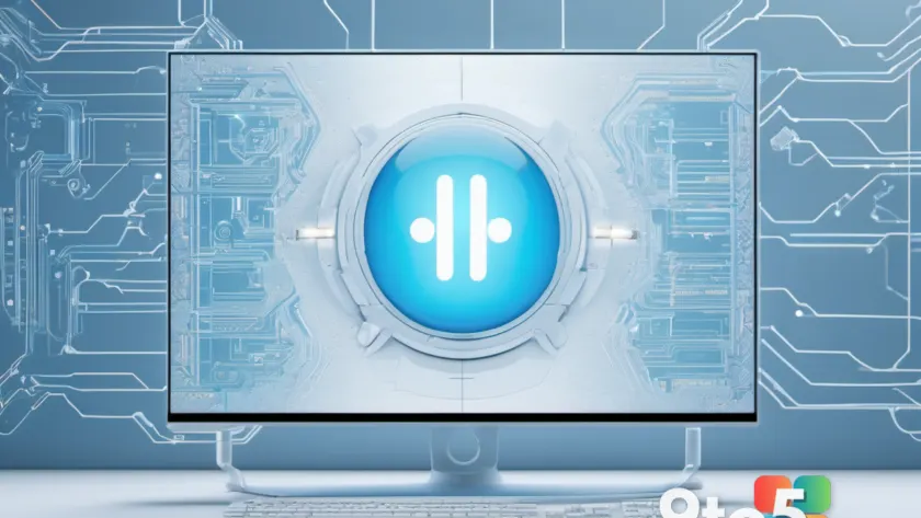
The leaked asset points to a Copilot icon that strips away much of the complexity found in the current design. Instead of the layered, gradient-heavy appearance that has defined the assistant’s presence in the taskbar and Start menu, the new version appears to favor flat, simplified shapes with a focus on negative space. This aligns with broader trends in modern UI design, where companies are moving toward cleaner, more accessible visual cues that reduce cognitive load.
While the exact specifications of the leaked icon have not been fully detailed, early images shared by researchers highlight a more subdued color palette and a refined geometric approach. If accurate, this would mark a significant departure from the vibrant, multi-toned icon that has been in use since Copilot’s initial rollout. The change would likely affect how the assistant appears in the taskbar, the Start menu, and within various Microsoft applications that support Copilot integration.
Why Microsoft Might Be Changing It
Design evolutions like this rarely happen in isolation. Microsoft has been steadily refining its Copilot experience, focusing on deeper system integration, improved responsiveness, and expanded capabilities across productivity tools. A visual refresh often accompanies these functional upgrades, signaling to users that the feature has matured and is ready for a more polished presentation.
Additionally, the push toward minimalism may reflect Microsoft’s broader design strategy. The company has been aligning its applications with a more unified aesthetic, reducing visual clutter and ensuring consistency across platforms. A simpler Copilot icon would fit seamlessly into this approach, making the assistant feel less like a standalone tool and more like a native part of the Windows environment.
It is also worth noting that icon redesigns can serve practical purposes. A more streamlined asset may scale better across different screen resolutions, improve accessibility for users with visual impairments, and reduce rendering overhead on lower-end hardware. These factors, while secondary to branding, often influence design decisions at the enterprise and consumer levels alike.
What This Means for You
If you are a regular user of Copilot, a redesign could mean a slightly different visual experience in your taskbar and Start menu. The core functionality of the AI assistant will remain unchanged, but the way it appears on your screen may feel fresher and more integrated into your workflow. For those who prefer the current design, the shift might take some getting used to, especially if the new icon is significantly simpler than what you are accustomed to.
From a practical standpoint, this leak suggests that Microsoft is actively working on refining the Copilot experience. Users who rely on the assistant for productivity tasks, coding assistance, or creative workflows may notice subtle improvements in how it is presented across Windows 11. The change could also indicate that Microsoft is preparing for a broader update that will roll out Copilot enhancements to a wider audience, including enterprise and education users.
How to Get It
As of now, the new Copilot icon has not been officially released, and there is no set timeline for when it might appear in a public update. Microsoft typically rolls out design changes through cumulative updates or feature drops, meaning users will likely see the new icon as part of a broader Windows 11 update rather than a standalone change.
To stay ahead of potential updates, ensure that your system is set to receive the latest patches and feature updates. You can check for updates by navigating to Settings > Windows Update and selecting Check for updates. If the new icon is included in an upcoming release, it will appear automatically once the update is installed.
In the meantime, the leak serves as an interesting glimpse into Microsoft’s design direction. Whether the final version matches the leaked asset or undergoes further refinement, one thing is clear: the Copilot icon is likely to evolve as the AI assistant continues to become a more integral part of the Windows experience.
Source: Neowin
Over to you: Are you hoping for a simpler Copilot icon, or do you prefer the current design?
You may also like
 Microsoft Pushes Entra ID Toward Passkey-First Authentication With New Warning Emails
 Permanently Disable Microsoft’s Hidden GDID Tracker on Windows 11 and 10 with This Script
 Cloudflare OS: The Open-Source Operating System for the AI-First Enterprise
 Microsoft Uses Planner New Outlook Integration to Drive Migration, Leaving To Do Behind