
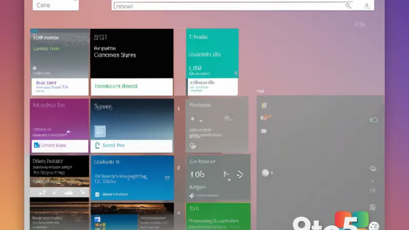
Windows 8 is arguably the most divisive operating system Microsoft ever shipped. Launched in October 2012, it traded the familiar Start Menu for a tile-based Start Screen and leaned hard into a touch-first design that left many desktop users frustrated. Now, an enthusiast has put together a concept called the Windows 8 Remastered concept that asks a simple question: what if Microsoft had kept that bold design language but fixed the parts that annoyed everyone?
The result, according to the concept’s presentation, is a look and feel that could make even longtime skeptics reconsider their distaste for the OS. Let’s walk through what the concept envisions and why Windows 8 earned its reputation in the first place.
What the Windows 8 Remastered concept actually is
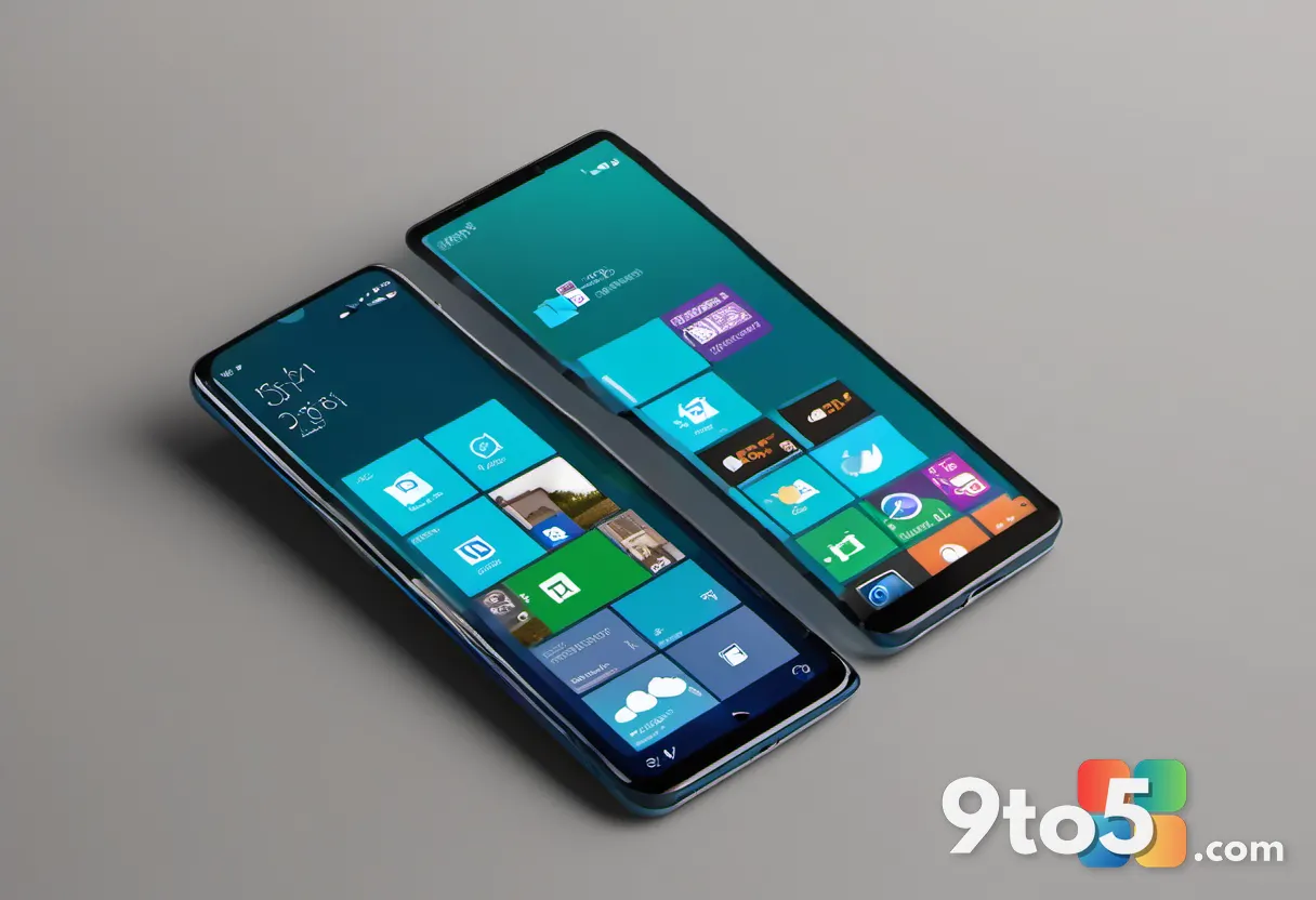
At its core, the concept is a design study rather than a working build. It takes Windows 8’s signature aesthetic — the flat, colorful tiles and the full-screen Start Screen — and reworks the interactions that historically drove people crazy.
Rather than abandoning the tile-based approach entirely, the concept keeps the design philosophy intact while addressing the specific pain points that made the original so polarizing. In practice, that means preserving the visual identity that made Windows 8 distinct while smoothing out the usability gaps that desktop users ran into.
It’s worth noting up front that this is a fan-made concept, not anything from Microsoft. It represents what one enthusiast believes the OS could have had if the company had listened more closely to desktop feedback during development.
Why Windows 8 upset desktop users
To understand why the concept is getting attention, it helps to recall what went wrong with the original. When Windows 8 launched, it removed the Start Menu — a staple of Windows since Windows 95 — and replaced it with the Start Screen, a grid of live tiles optimized for touchscreens.
For people using a mouse and keyboard on a traditional desktop or laptop, that was a jarring change. The Start Screen launched full-screen on top of the Desktop, requiring an extra step to get back to where you’d been working. The Charms bar, reachable only by swiping from a screen’s edge or moving your cursor to a corner, felt unintuitive on non-touch hardware.
The backlash was significant enough that Microsoft walked back some of the most drastic changes. Windows 8.1, released in 2013, added a small Start Menu button in the corner. Then Windows 10, in 2015, brought back a proper Start Menu that blended the best of both worlds — a move widely seen as the company finally correcting course.
What the concept changes
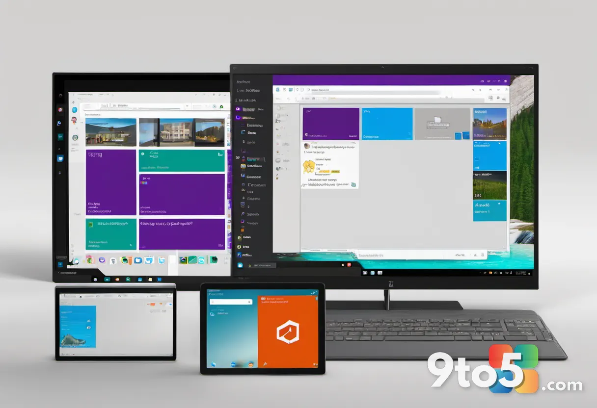
The Windows 8 Remastered concept imagines a middle ground: the bold, tile-driven look of Windows 8 combined with the usability refinements that eventually arrived. The exact details are the creator’s interpretation, but the general direction is clear — keep the design, fix the friction.
For desktop users, the implication is an OS that doesn’t force you to abandon familiarity in favor of a touch-first interface. It’s the idea that Windows 8’s visual language was ahead of its time, even if its initial execution missed the mark for traditional computing.
Concepts like this often highlight how design trends eventually get absorbed into later releases. The live tiles, for instance, resurfaced in various forms in Windows 10 and Windows 11, suggesting that the core idea behind Windows 8 wasn’t entirely lost — just poorly delivered at first.
What this means for you
For most users, the Windows 8 Remastered concept is a fun piece of design nostalgia rather than something you can install or expect to see in a future update. Microsoft has no plans to revive Windows 8, and the operating system reached end of support years ago.
But concepts like this serve as a useful mirror. They remind us how user feedback shapes an operating system over time and how a design that seemed radical at once can feel dated — or even refreshing — later on. If you’ve always disliked Windows 8, this concept might just make you see why it was so controversial in the first place.
And for anyone curious about design history, it’s a reminder that even the most criticized products can contain ideas worth revisiting.
Where to see the concept
The concept is shared through the usual channels for fan-made design work, and it’s drawn attention precisely because it makes a compelling case for a version of Windows 8 that never existed. Whether you love it or hate it, it’s a creative look at one of Microsoft’s most talked-about releases.
Source: Neowin
Over to you: Would you welcome a Windows 8 that kept its bold tiles but fixed the Start Menu — or is the OS best left in the past?