
Microsoft has officially acknowledged what many Windows users have felt for years: the Windows 11 right-click menu became cluttered and sluggish over time, and the company is now rolling out a comprehensive redesign to fix it. This isn’t just a theoretical promise; the changes are already live for Windows Insiders in Experimental Build 26340.9212, released on August 17, 2026.
The new design addresses the core complaints that have plagued the modern context menu since its launch. By reducing visual clutter, improving load speeds, and introducing a dedicated customization panel, Microsoft is attempting to reverse a trend that had seen the Windows 11 experience fall behind its predecessor in terms of responsiveness and usability.
The Five-Year U-Turn on Context Menu Design
To understand the significance of this update, it helps to look back at the original justification for the change. When Microsoft launched Windows 11 in 2021, the company argued that the Windows 10 context menu had become unwieldy. In a July 2021 blog post titled “Extending the Context Menu and Share Dialog in Windows 11,” Microsoft described the older menu as having grown in an “unregulated environment for 20 years, since Windows XP.”
The company noted that common commands like Cut, Copy, Paste, Delete, and Rename were positioned far from the cursor, making them difficult to reach. Rarely used commands were mixed in with essential ones, and third-party app extensions lacked consistent organization. Some extensions even ran directly inside the Explorer process, which Microsoft claimed could negatively impact performance and reliability.
The solution at the time was to move common actions closer to the invocation point, group related commands, and provide a more structured system for app extensions. The “Show more options” toggle was kept as a safety net, allowing users to access the legacy Windows 10 menu for any commands that hadn’t been ported over yet.
However, as Windows Latest pointed out in November 2024, the new menu eventually fell into the same clutter trap it was designed to eliminate. By June 2026, testing revealed that extensions like Ask Copilot, Clipchamp, Notepad, Paint, and Photos would load asynchronously after the menu had already opened. This caused the cursor position to shift as new items appeared underneath it, leading to misclicks and a frustrating user experience.
In its August 17 announcement on the Windows Insider Blog, Microsoft now uses language that closely mirrors its 2021 critique of Windows 10. The company stated that the menu “became cluttered and sluggish,” and recognized the need to “dramatically reduce the time between right-clicking and having a menu that’s fully ready to use.”
Speed and Layout Improvements
The most immediate change in the redesigned context menu is the focus on speed. Microsoft has optimized the loading process to ensure that all items, including app extensions, are rendered before the menu appears. This eliminates the cursor-shifting issue that plagued previous versions and makes the menu feel instant, even on lower-spec hardware.
The default layout has also been simplified. The new menu contains fewer top-level actions, reducing visual noise while keeping commonly used commands within reach. The primary actions—Cut, Copy, Rename, Share, and Delete—are displayed in a compact horizontal icon row at the top of the menu.
For users who prefer the traditional vertical arrangement found in Windows 10, a new setting allows you to toggle “Arrange primary actions inline.” This drops the commands into a vertical list, closer to how they appeared in the older OS, but with the updated modern design language.
Dedicated Customization Settings
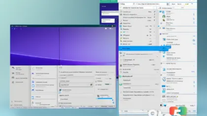
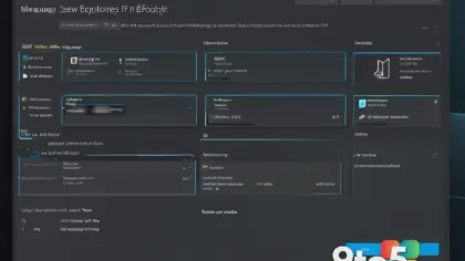
The centerpiece of this redesign is the introduction of a dedicated “Customize menu” option at the bottom of the context menu. Clicking this opens a new Settings page under Personalization > Context menu, giving users granular control over what appears when they right-click a file.
This settings page is divided into three main areas:
- Built-in Windows Actions: Commands like Send to, Print, Create shortcut, Copy as path, and Rotate image can each be toggled on or off individually. By default, Send to and Print are off, while Copy as path is on, reflecting typical user habits.
- App Extensions: You can now choose whether app extensions like Notepad, Paint, and Photos appear directly in the main menu, are tucked into a submenu, or are hidden altogether. This prevents the menu from becoming overcrowded with frequently unused tools.
- Layout Options: Additional controls allow you to manage how familiar commands are displayed, including keeping cloud storage actions in their own section and moving Properties to the bottom of the menu.
This level of customization was previously unavailable, forcing users to accept whatever Microsoft deemed necessary for the average user. Now, you can tailor the context menu to your specific workflow, whether that means prioritizing speed by hiding all extensions or maximizing accessibility by keeping essential commands visible.
Preserving Compatibility with Legacy Tools
While Microsoft pushes the modern context menu forward, it has made it clear that compatibility with older applications remains a priority. The “Show more options” toggle is still present, ensuring that users can access the legacy context menu for apps that haven’t adopted the new extension model.
This is particularly important for power users who rely on tools like 7-Zip, which still depend on the legacy menu for full functionality. By maintaining this escape hatch, Microsoft avoids breaking workflows for users who have built their habits around the older interface.
Additionally, the new settings allow you to keep cloud storage actions in their own section, preventing OneDrive-related commands from mixing into the general extension list. This separation helps users quickly identify and manage cloud-specific operations without sifting through unrelated app shortcuts.
Broader File Explorer Improvements
The context menu redesign is part of a larger effort to improve the overall File Explorer experience in Windows 11. Microsoft has been working on fixing freezes, hangs, navigation issues, renaming problems, and the Address Bar, continuing work that began in March 2026 when the company first admitted that File Explorer had been slower than its Windows 10 counterpart for years.
This holistic approach suggests that Microsoft is committed to addressing the underlying performance and usability issues that have accumulated over the past five years, rather than just applying superficial fixes. The goal is to make File Explorer a more reliable and efficient tool for managing files and folders.
What This Means for You
For everyday users, this update means a faster, cleaner, and more personalized right-click experience. You will no longer have to deal with menus that load slowly or shift unexpectedly, and you can finally remove commands you never use. For power users, the ability to customize the menu layout and control app extensions provides a level of flexibility that was previously missing.
How to Get It
The redesigned context menu is currently rolling out to Windows Insiders in the Experimental channel via Build 26340.9212. Microsoft notes that the feature is being released gradually, so even if you are in the Experimental channel, you may not see the new menu immediately. If you are not yet an Insider, you will need to wait for the feature to be tested and refined before it reaches the stable Windows 11 release.
As Microsoft continues to gather feedback from Insiders, expect further adjustments to the customization options and layout settings. This update represents a significant step toward making the Windows 11 right-click menu the fast, customizable, and clutter-free experience that users have wanted for years.
Source: Windows Latest
Build details:
- 26H2
Over to you: Which built-in action do you find yourself using most often in the context menu, and would you keep it on by default?