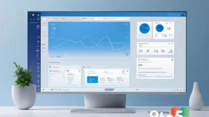

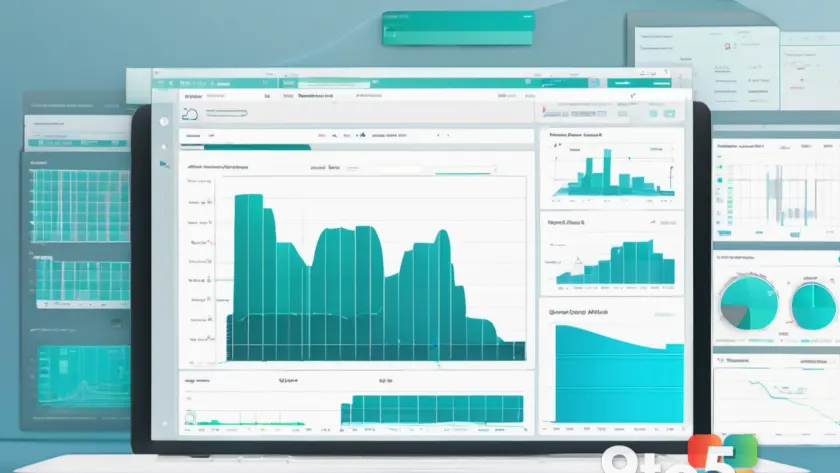
Microsoft is adding a new Copilot capability to Excel that could make one of the trickiest parts of the program a lot easier: turning a sprawling, hard-to-read workbook into a clean, interactive dashboard. Called Copilot Canvas, the feature uses AI to build a live, visual summary of your data that updates on its own.
#1 Copilot Canvas
The core of the announcement is straightforward. According to an updated Microsoft 365 roadmap entry, Copilot Canvas generates “a polished, interactive view of key visualizations, metrics, and insights” from your workbook data. The crucial detail is that it stays connected to the source data, so when the workbook changes—whether you edit cells manually or pull in data from another source—the canvas updates automatically. You can also refine it by chatting with Copilot.
This matters because of a common real-world scenario. Open a complex financial model with dozens of linked sheets and you’re unlikely to grasp the whole picture immediately. Copilot Canvas aims to bridge that gap by presenting the important numbers and trends in one place, rather than forcing you to navigate the underlying spreadsheet.
Microsoft is drawing a clear line between this and what Copilot already does. The feature is not a static, AI-generated summary that goes stale the moment you finish reading it. Instead, it functions more like a living dashboard that tracks your workbook in real time, refreshing whenever the underlying data shifts.
Right now, Copilot in Excel can already create templates from a prompt, build dashboards, spot trends and outliers, generate PivotTables and charts, edit existing charts, and pull information from the web with attributions. Copilot Canvas bundles all of that into a single, interactive view.
The feature is set to begin rolling out in the coming weeks, with most users expected to see it by early October, according to the roadmap.
#2 Inline citations
One of the more practical recent additions is inline citations. Copilot has long been able to pull information from the internet, but validating those answers was often a hassle. The new skill provides deeper source links so you can trace exactly where a response came from and check the original material yourself before acting on it.
#3 Theme design skill
Microsoft also introduced a “theme design” skill that applies harmonized color palettes and structured layouts to raw data. The idea is to take a messy set of numbers and give it a more polished, consistent look without you having to fiddle with formatting manually.
#4 Change history skill
The August 2026 update added a “change history skill” that shows how a workbook has evolved over time. It’s similar to Revisions in Word, but with an AI twist: Copilot can summarize recent changes, so you can see who made edits in a shared workbook and what changes were made by AI.
What This Means for You
For everyday Excel users, the appeal is time saved on presentation. If you regularly build reports or dashboards for colleagues, Copilot Canvas could replace a lot of manual chart-placing and formatting with a single prompt and an auto-updating view.
That said, it’s worth noting Microsoft’s own track record here. The company’s Copilot integration in Excel has drawn mixed reviews, with many users preferring third-party tools for spreadsheet AI. The Canvas approach is a meaningful step toward something genuinely useful, but real-world results will depend on how well it handles messy, real data rather than clean samples.
The broader trend is clear: Microsoft keeps folding new Copilot skills into Excel for Windows 11, shifting away from the controversial floating button toward features that sit inside the ribbon and do concrete work.
How to Get It
Copilot Canvas is rolling out over the coming weeks, so there’s no specific date or update to install. If you have an eligible Microsoft 365 subscription with Copilot access, you should see the option appear in Excel automatically once it reaches your account. Keep the app updated, and watch for the feature to show up in your Copilot pane.
Source: Windows Latest
Over to you: Will Copilot Canvas change how you build dashboards in Excel, or do you prefer sticking with manual charts and PivotTables?
You may also like
 Microsoft Is Auto-Enabling Memory Integrity on Windows 11 Starting October 2026
 Windows 11 26H2 Has Entered the Preview Channel — Here’s What That Means
 Windows 11’s new context menu buries custom entries even deeper
 Windows 11 finally lets you OneDrive opt out of backup after years of dark pattern complaints