
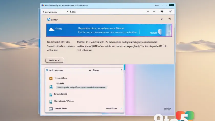
The Properties dialog box is one of the most recognizable interfaces in Windows history. Since its introduction in Windows 95, it has served as the go-to location for viewing file details, adjusting system settings, and managing hardware configurations. For decades, the layout remained largely consistent, with tabs for General, Security, and Custom, sitting alongside a familiar icon set. While functional, the design has not kept pace with the visual language of modern Windows 11, leading many users to feel it belongs in a bygone era.
Community Designers Take a Crack
Recently, a wave of community-driven redesigns has emerged, with UI enthusiasts and concept artists reimagining how the Properties dialog could look in a contemporary Windows environment. These concepts often feature rounded corners, updated typography, and a shift toward Microsoft’s Fluent Design System, incorporating Mica and Acrylic materials. Designers are also experimenting with new iconography and a more streamlined tab structure, aiming to reduce visual clutter while maintaining accessibility.
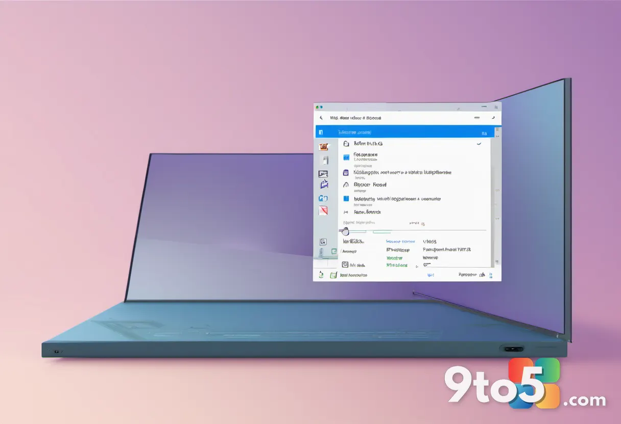
One popular trend among these concepts is the integration of a “quick actions” panel, similar to the one found in the Settings app. This allows users to perform common tasks, such as opening the file location or changing permissions, without navigating through multiple sub-menus. By bringing these actions to the forefront, designers hope to make the Properties dialog feel more integrated with the rest of the operating system.
Why the Divide?
Despite the creativity on display, these concepts have sparked significant debate within the Windows community. While some users applaud the effort to modernize a dated interface, others argue that the changes go too far. Critics point out that the Properties dialog is deeply ingrained in muscle memory, and radical alterations could disrupt workflows for power users who rely on its traditional layout.
The divide often centers on the balance between innovation and familiarity. Some concepts embrace a completely new aesthetic, borrowing heavily from the Settings app’s design language. Others take a more conservative approach, simply updating the visual elements while preserving the underlying structure. This split reflects a broader tension in the Windows community: the desire for a fresh, modern look versus the comfort of a proven, consistent interface.
What This Means for Windows 11
While these concepts are not official Microsoft designs, they offer a glimpse into what users might expect in future updates. Microsoft has been gradually modernizing various system dialogs, and the Properties box is a likely candidate for a refresh. However, any official changes will need to carefully weigh user feedback to avoid alienating the segment of the community that prefers the classic look.
For now, these concepts serve as a creative outlet for designers and a conversation starter for users. They highlight the ongoing evolution of Windows UI and the diverse opinions within the community about where it should go next. Whether Microsoft adopts elements of these designs or sticks to a more incremental approach, the dialogue around the Properties dialog box is sure to continue.
Where to Find These Concepts
If you’re interested in seeing these redesigns for yourself, they are primarily shared on platforms like DeviantArt, Twitter, and Reddit’s r/Windows11 community. Searching for terms like “Windows 11 Properties dialog concept” or “Fluent Design Properties” will yield a variety of results. Keep in mind that these are fan-made designs and not official previews, but they provide a fascinating look at how the community envisions the future of Windows interfaces.
What This Means for You
For everyday users, the debate over the Properties dialog box is largely symbolic. Unless you are a UI designer or a power user deeply invested in Windows aesthetics, the changes are unlikely to impact your daily workflow. However, it does reflect Microsoft’s broader commitment to refining the user experience, one dialog at a time. If you have strong opinions on how the Properties dialog should look, now is a good time to share them with the community or provide feedback through official Microsoft channels.
Source: Neowin
Over to you: Do you prefer the classic Properties dialog layout, or are you ready for a modern redesign?
You may also like
 Windows 11 Build 26220.8925 Brings Native Touchpad Tuning and Start Menu Toggles to Beta
 Blizzard Unveils BlizzCon 2026 Digital Bundles with Exclusive In-Game Rewards
 RuneScape CEO Claims Studio Aims to Overtake World of Warcraft as Top MMO
 Microsoft Kills SMS and Voice MFA in Entra by February 2027, Mandates Passkeys